Discover the 30 best construction company websites! Get inspired by innovative designs, user-friendly interfaces, and powerful branding. Don’t miss these industry-leading examples!
Did you know that 75% of people judge a company’s credibility based on its website design? That’s right! In the construction industry, where trust and professionalism are paramount, having a stellar website isn’t just nice to have – it’s essential.
Today, we’re diving into the crème de la crème of construction company websites. These 30 gems aren’t just pretty faces but powerful tools that showcase expertise, attract clients, and set the bar high for the entire industry.
Ready to get inspired? Let’s roll up our sleeves and explore these digital masterpieces!
1. Maman Corp
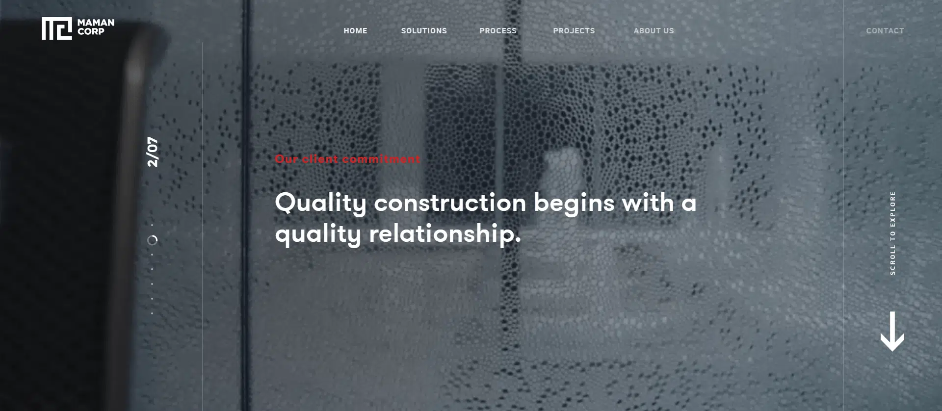
Maman Corp’s website is like a digital rollercoaster for your eyeballs! This isn’t just a website; it’s a masterpiece of engagement that’ll have you glued to your screen faster than wet cement.
Picture this: you land on their homepage, and BAM! Captivating videos start dancing across your screen. But wait, there’s more! As you scroll, the whole page comes alive with smoother dynamic transitions than a freshly paved road.
Every pixel, from the sleek design to the perfect font choice and color palette, has been handpicked to keep you hooked. It’s like they’ve got a Ph.D. in user engagement! This isn’t just eye candy, folks. This carefully crafted digital experience screams “We know our stuff!” louder than a jackhammer at 7 AM. Maman Corp doesn’t just build structures; they’re constructing a new level of brand communication!
2. Mike Schaap Builders Inc.
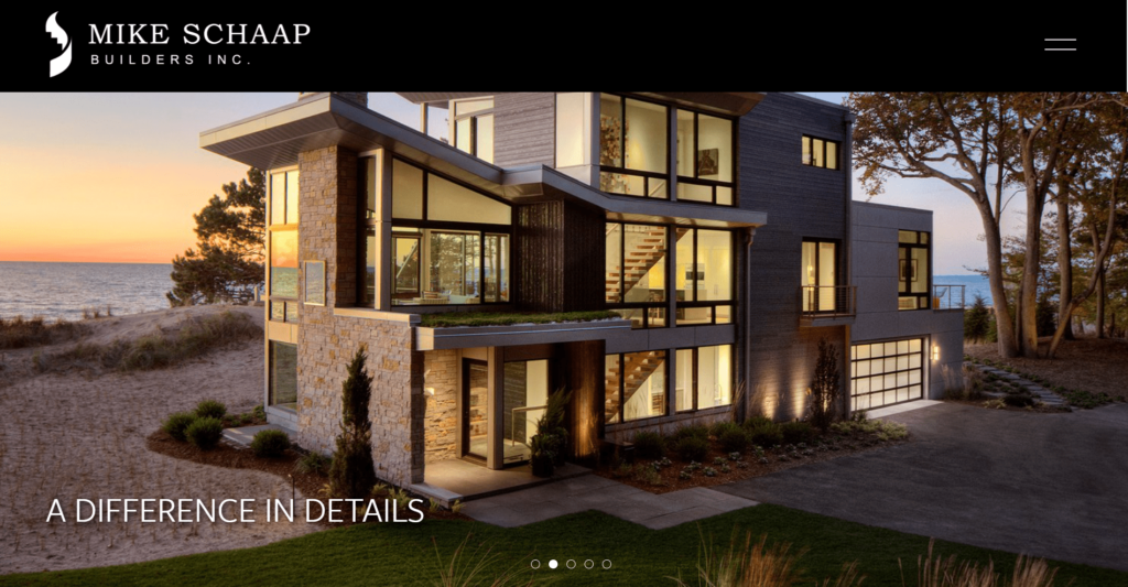
Talk about making a grand entrance! Mike Schaap Builders’ website hits you with a hero slider that’s simpler than a spirit level but more elegant than a custom staircase. It’s proof that sometimes, less really is more in web design.
But don’t let the straightforward approach fool you – this site works smarter, not harder. They’ve mastered the art of negative space like a Zen master of web design. The result? A clean, organized look that’s easier to navigate than a well-planned construction site.
Information here isn’t just presented; it’s served up on a silver platter. Everything’s laid out in bite-sized chunks that even your great-aunt Mildred could understand. It’s this thoughtful approach to user-friendliness that drives home Mike Schaap’s professionalism. You can practically feel the attention to detail oozing through your screen – just like in their real-world projects!
3. Robins & Mortin
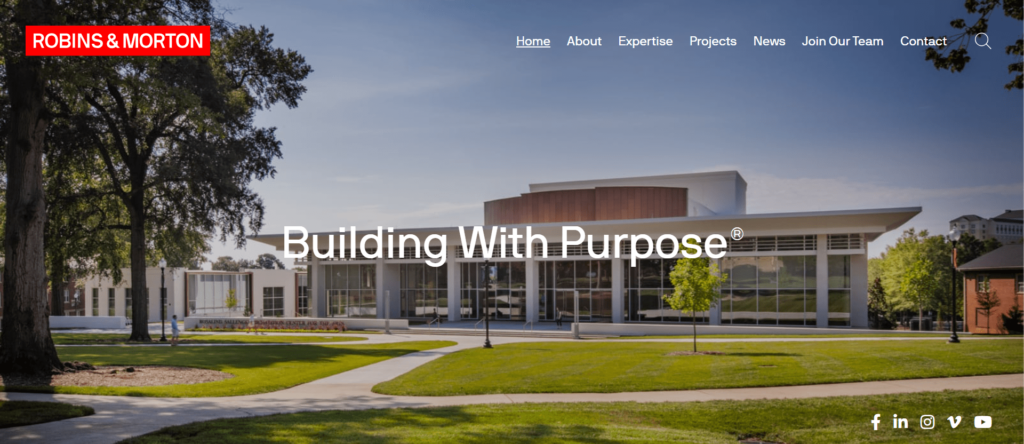
Robins & Mortin’s construction company website isn’t just another click-and-scroll experience—it’s a masterclass in digital design that’ll have you cruising through pages like a hot knife through butter! Picture this: you land on their site, and it’s like stepping into a well-oiled machine. The layout? Slicker than a new coat of paint, making it a breeze to find exactly what you need.
Every detail, from the minimalist design to the intuitive navigation, is so well-engineered it practically shouts, “We know what we’re doing!” No fluff, no frills—just pure, unadulterated user-friendliness that makes exploring their projects as smooth as a freshly poured foundation. Robins & Mortin doesn’t just showcase their work; they craft an online experience that’s as solid as the structures they build, earning their place among the best construction company websites out there.
4. McCownGordon
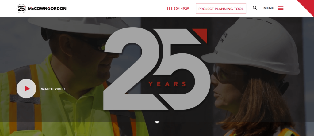
The McCownGordon construction company website is like a digital blueprint for project planning brilliance! This isn’t just a site; it’s a powerhouse of innovation that’ll have you mapping out your next big build faster than you can say “groundbreaking!”
Imagine this: you hit their homepage, and BOOM! Their unique Project Planning Tool leaps out, practically begging you to start crafting your next masterpiece. But hold on—there’s more! As you dive deeper, the site doesn’t just show you around; it wraps you in a cocoon of cutting-edge trends, tech insights, and safety standards that scream, “We’re the pros you’ve been looking for!”
Every click, every scroll, is a seamless journey through McCownGordon’s world of top-tier service and customer-centric focus. This isn’t just a construction company website—it’s a digital command center that’s as innovative as the projects they bring to life, cementing McCownGordon’s spot at the forefront of the industry.
5. Mace
Talk about setting the bar high! Mace Group’s building construction company website welcomes you with a blend of sophistication and simplicity that’s as striking as their real-world projects. This isn’t just a site—it’s a virtual masterclass in how to present a global consultancy and construction firm.
From the moment you land, high-quality videos and stunning images grab your attention, showcasing Mace Group’s top-notch services like project management, general contracting, and facilities management. It’s the kind of visual storytelling that makes you sit up and take notice.
But don’t let the sleek visuals fool you—this site is as practical as it is beautiful. The well-structured menu bar makes finding information easier than locating a stud in drywall. And let’s talk about the “People” page. It doesn’t just list names; it adds a personal touch by putting faces to the expertise, making it clear that Mace Group is all about building connections, not just structures.
In a nutshell, this building construction company website nails the balance between professionalism and approachability, much like Mace Group does in their industry-leading projects.

WEBSITES FOR CONSTRUCTION
6. Bill Huey + Associates
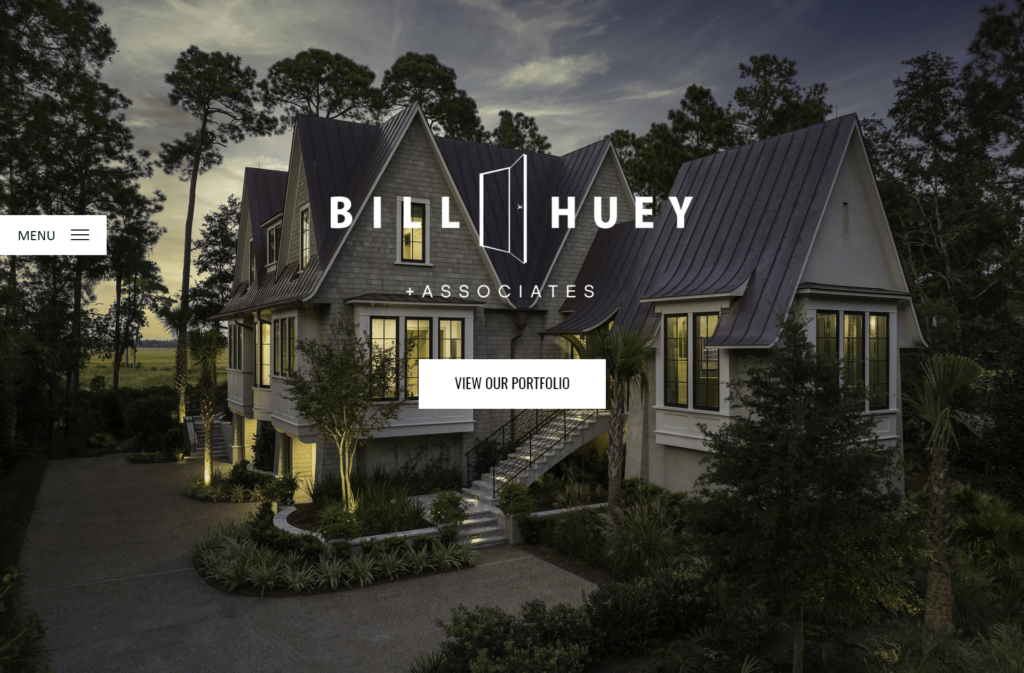
Strap in because this commercial construction company’s website is about to take you on a visual ride! We’re talking a well-structured design that’s not just easy on the eyes but feels like it’s been engineered by a team of digital architects. The consistent colors and subtle animations don’t just enhance the user experience—they turn it into a seamless journey.
From the moment you hit the homepage, you’re hit with stunning visuals and high-quality photography that scream “premium branding.” But this isn’t just some static display. Oh no, the portfolio is right there, ready to be explored with just a few clicks, making it as easy as navigating through the best construction company websites out there.
It’s the perfect fusion of design and accessibility, making the site both visually appealing and user-friendly. In a nutshell, this website doesn’t just show off the company’s capabilities—it practically shouts them from the digital rooftops!
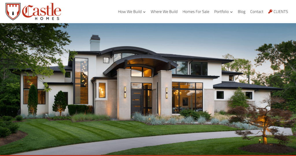
7. Castle Homes
Castle Homes’ website isn’t just a digital showcase—it’s a high-octane thrill ride for your senses! Buckle up and get ready to be dazzled, because this construction website company knows how to make an entrance.
Imagine landing on their homepage and—BOOM!—you’re hit with jaw-dropping, high-definition photography that instantly transports you into the world of bespoke homes. But don’t blink; the magic doesn’t stop there. As you explore, the page moves with smooth transitions that are more graceful than a perfectly executed design plan.
Every detail, from the mission statement to the team profiles, is laid out with precision. It’s like they’ve got a Ph.D. in digital design! The portfolio? It’s a masterpiece in itself, showcasing their craftsmanship with the flair of a top-tier custom home builder.
And if you’re eco-conscious, hold on to your hats. Their ‘Green Building’ section is a shining example of sustainability, blending seamlessly into the site like a well-designed eco-friendly home. Castle Homes isn’t just building houses; they’re crafting an unforgettable digital experience that reflects their unparalleled expertise and dedication.
8. Luxury Simplified
Luxury Simplified, established in 2013, excels in property management and real estate by offering a one-stop-shop experience. Initially real estate investors in Charleston, they built a portfolio of downtown homes, setting themselves apart from traditional firms.
Their website stands out with its elegant visuals and clear layout, effectively showcasing their diverse services in construction, real estate, and vacation rentals. The design invites users to explore South Carolina’s beauty while engaging with the brand’s offerings, enhancing user interaction and brand image.

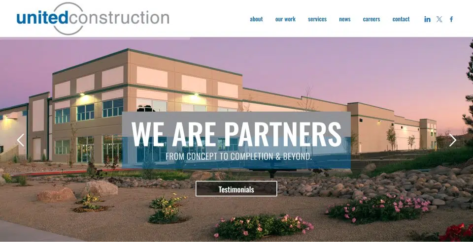
9. United Construction
Talk about making a grand entrance! United Construction’s website hits you with a header slider that’s as slick as a freshly poured concrete slab and as dynamic as their design and construction solutions.
But don’t be fooled by the simplicity – this site isn’t just about looks. It’s a masterclass in construction company website design, showcasing their expertise with a clean layout that’s smoother than a perfectly finished floor.
Everything you need to know is laid out in a way that’s as easy to navigate as their real-world projects. With captivating portfolio videos and insightful articles right on the homepage, it’s clear that United Construction knows how to build a killer site and deliver top-notch customer satisfaction.
10. Suffolk America’s Contractor
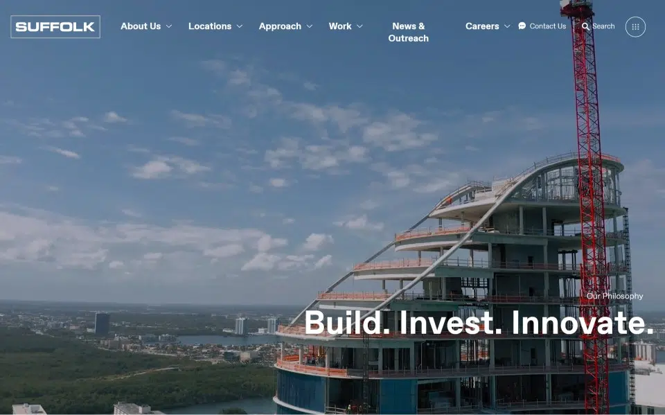
At America’s Contractor, they take pride in being a construction company that truly cares about their people, partners, quality, and innovation. Their commitment to social impact is evident in everything they do, from building an inclusive culture to ensuring the safety of their workers.
Their website reflects this dedication with a clean design, featuring videos and soft, complementary colors. The homepage effectively showcases their work through stunning images that perfectly capture their values, making it a standout construction company website.
TOP CONSTRUCTION WEBSITES
11. Bechtel Group INC
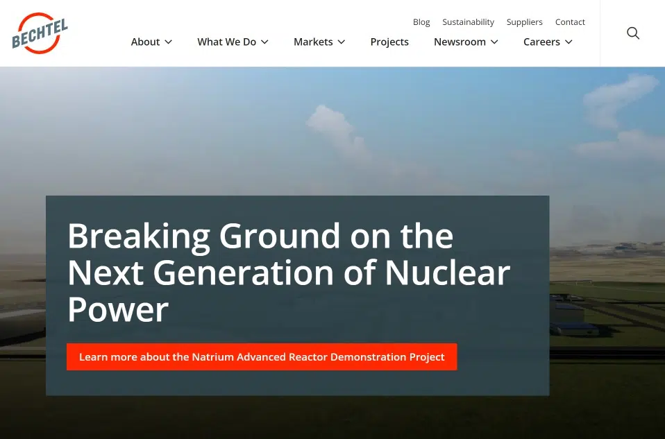
Bechtel, founded in 1898 and headquartered in San Francisco, is a leading global engineering, construction, and project management firm. As one of the largest privately-owned construction companies, Bechtel is renowned for its work on major infrastructure projects like the Hoover Dam and the Channel Tunnel.
Their construction company website stands out with its clean, straightforward design, using minimal content and subtle colors to effectively communicate their expertise and services. This approach ensures visitors quickly grasp the company’s capabilities and excellence.
12. Turner
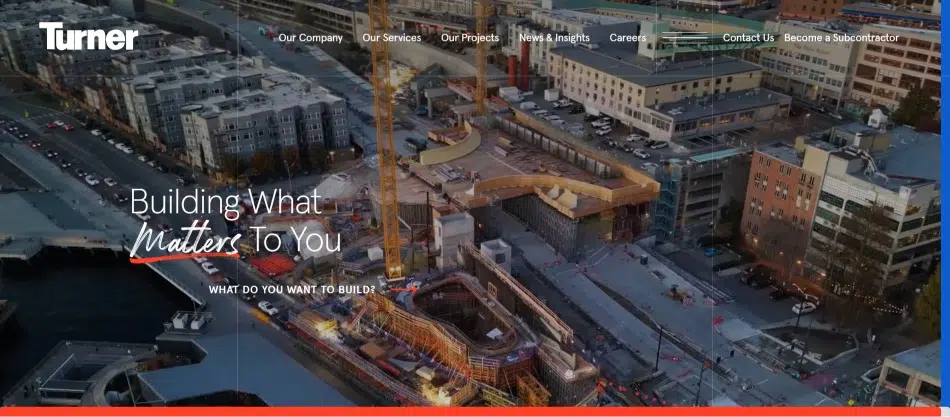
Their vision is to be the top provider of global construction services and technical expertise, making a positive impact on people, customers, communities, and the environment.
Their construction company website stands out with its unique, elegant design, featuring smooth animations and well-structured sections that efficiently present content in a compact space. This approach not only enhances user experience but also effectively communicates the company’s values and services. Among construction company website examples, this one excels at making a lasting impression and showcasing what sets them apart in the industry.
13. Perkins Eastman
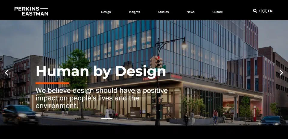
Talk about making a grand entrance! Perkins Eastman’s website is like a masterclass in construction websites design. With a sleek and sophisticated layout, it presents its global architecture and design expertise in style.
But don’t be fooled by the elegance—this site is more than just a pretty face. It combines smart design with seamless functionality, showcasing their projects with stunning visuals and easy navigation. The well-organized menu is as precise as a blueprint, making it effortless for visitors to explore their work and guiding principles.
Information isn’t just shared; it’s delivered with finesse, reflecting Perkins Eastman’s commitment to sustainable and people-centric design. You can practically feel their dedication to excellence through the screen—just like in their real-world projects!
14. Schimenti Construction
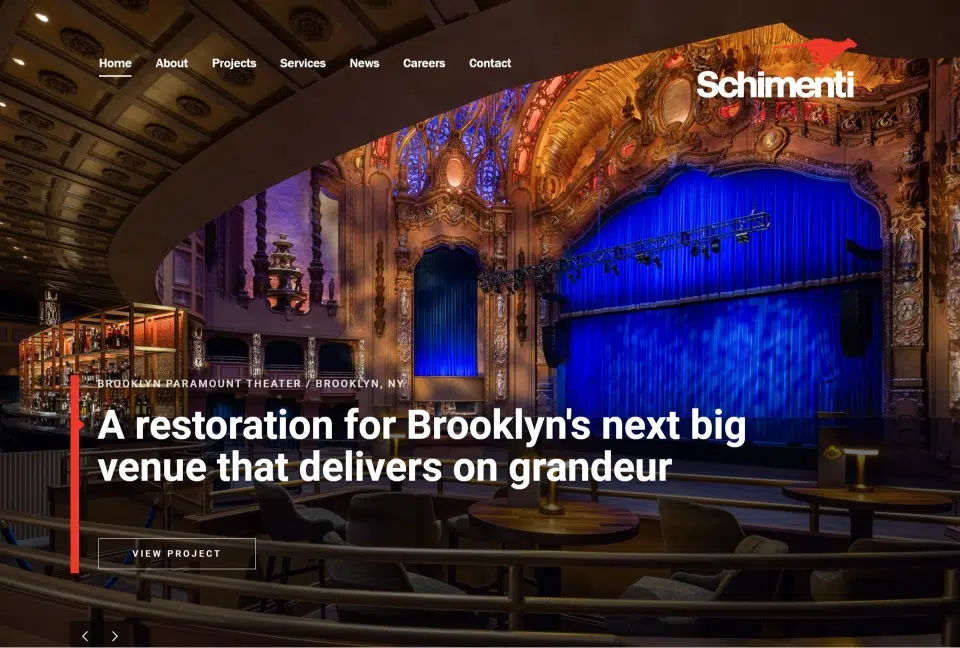
Talk about making a grand entrance! Schimenti Construction Company’s website is like the rock star of the best construction websites out there. Imagine landing on their homepage and being greeted by a site that’s as dynamic as their impressive portfolio!
The moment you dive in, BAM! You’re hit with a showcase of their top-notch projects and accolades, including that impressive National Safety Award. But wait, there’s more! As you explore, the site transitions smoother than a freshly laid asphalt road, keeping you engaged with every click.
Every element, from the sleek layout to the eye-catching graphics, is crafted with precision. It’s like Schimenti Construction is shouting, “We’re the best in the business!” straight from their homepage. This site isn’t just about flaunting their success; it’s about making sure you know they’re at the top of their game in construction management and renovation.
15. Weitz
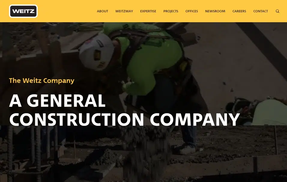
Talk about making a grand entrance! The Weitz Company’s website is like the VIP lounge of the best construction company websites out there. It’s not just a site; it’s a high-impact digital experience that’s got you hooked faster than you can say “construction excellence.”
Picture this: you land on their homepage, and BAM! Engaging videos start rolling, giving you an insider’s view of their impressive projects. But wait, there’s more! As you scroll, the page flows with transitions smoother than a freshly paved highway, keeping you hooked every step of the way.
Every detail, from the sleek black and yellow color scheme to the polished layout, screams professionalism. It’s like The Weitz Company is giving you a front-row seat to their legacy of quality and versatility. This isn’t just about showcasing their work; it’s about making sure you know they’re the real deal in commercial, industrial, healthcare, and hospitality construction. With clear navigation and client testimonials, this site makes it crystal clear why they’re a top player in the industry.
16. Sweenor Builders Incorporated
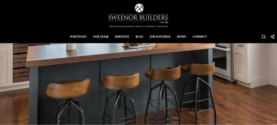
Talk about making a grand entrance! Sweenor Builders’ website is a powerhouse among the best building construction websites. It’s not just a site; it’s a full-on digital showcase that grabs your attention faster than a high-speed drill.
Picture this: you hit their homepage, and BAM! Stunning visuals of their coastal legacy homes immediately capture your gaze. As you explore, the site’s seamless navigation feels smoother than a perfectly laid foundation, making it a breeze to dive into their impressive portfolio and design services.
Every detail, from the sleek layout to the top-notch project showcases and team bios, is meticulously crafted to impress. It’s like Sweenor Builders is saying, “We’re experts, and we’re here to prove it!” This isn’t just about flaunting their work; it’s about solidifying their reputation as a leading custom home builder. With features like their work on “THIS OLD HOUSE” and detailed team profiles, the site hits all the right notes to connect with potential clients and highlight their standout services.
17. Blach Construction
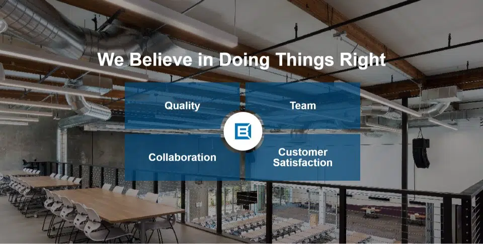
Talk about making a grand entrance! Blach Construction’s website is a jaw-dropper in the best website construction examples. It’s not just a site; it’s a masterclass in showcasing their expertise and innovation from the get-go.
Imagine this: you hit their homepage, and WHAM! You’re hit with a sleek, user-friendly layout that mirrors their 50 years of top-notch experience. The design isn’t just eye-catching—it’s brilliantly functional. As you scroll, you’re seamlessly guided through their impressive range of corporate, mixed-use, and tech projects with navigation that’s smoother than a freshly laid brick.
18. Scape Construct
19. Build Cover
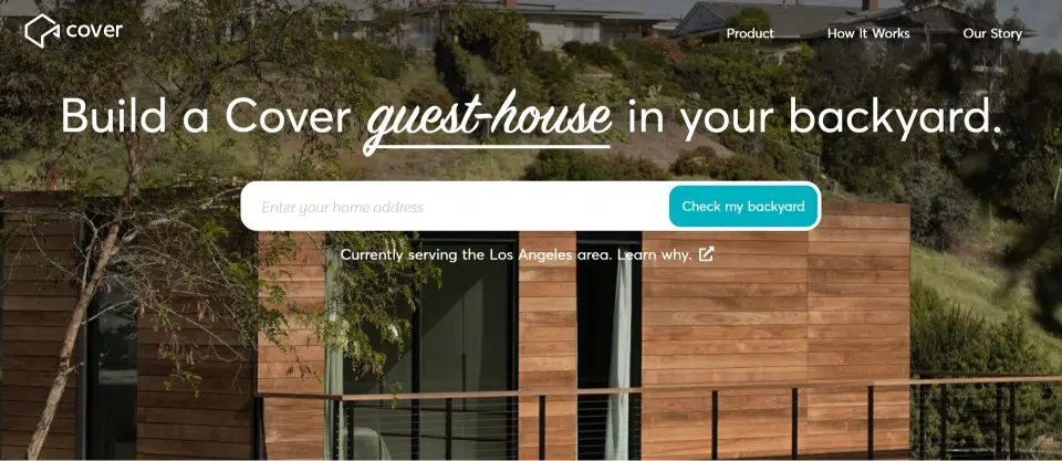
This website is highly informative, and perfectly tailored to showcase the unique products offered by the construction company. It features professional photos of their actual work, providing a true sense of quality. The virtual tour feature is a standout, allowing visitors to explore their offerings in greater detail. The site also boasts beautiful imagery that effectively captures and conveys the essence of its products, creating an engaging and visually appealing experience for users.





whoah this weblog is fantastic i love studying your posts.
Stay up the good work! You recognize, a lot of people
are looking round for this information, you could help them greatly.